MultiMedia
A Media Subscription App Case Study: Enhancing UX/UI to Convert Freemium Users to Premium Subscribers
Role: UI/UX Designer + Researcher
Duration: 4 weeks
Overview
In March 2024, I designed my capstone project, MultiMedia, aimed at converting free users into paying subscribers.
MultiMedia is a media (music, shows, movies and podcasts) product that offers mobile-web access and apps for both iOS and Android platforms.
Defining the User Problem
Our users are struggling to decide whether or not upgrading to premium is worth it.
How might we communicate the unique benefits of our premium features and clearly demonstrates the value of upgrading?
Here's What Research Shows
Successful Call To Action Buttons
Source: Medium Article
User Interviews - Quotes
Once you have free you feel like you own it so it makes it hard for you to give it up. You already know what itβs like on the other side
I also like the ability to download things onto my device as well as no ads
Having a banner helps. It serves as a constant reminder that the option to upgrade is always in sight
I hate whenever the notification canβt be close immediately
I like it when I see a crown next to all the things I have to upgrade. Itβs like knowing what premium has to offer in front of my eyes.
Itβs super important to make sure the free feature is good
Meet Emily
Emily is a 25-year-old marketing coordinator living in an urban area. She seeks unique experiences and values connections with like-minded individuals. Emily prefers mobile-first platforms with sleek design and enjoys access to cutting-edge technology and trendy fashion options. She is attracted to exclusive offers and experiences that align with her bold and hip lifestyle.
Emily would describe herself as outgoing, adventurous, trend-conscious.
Key Insights
Types of Incentivizing Features Most Effective in Encouraging User Subscription
Exclusive Content
Offering premium, exclusive content that is not available to free users can be a powerful incentive.
Ad-Free Experience
A compelling incentive for users who want uninterrupted content consumption.
Offline Viewing
Allowing users to download content for offline viewing enhances the convenience of the service.
HD or 4K Streaming
Providing high-definition streaming quality enhances the overall viewing experience & appeals to users seeking visual quality.
Free Trials
Providing a limited free trial period for premium features allows users to experience the benefits of a subscription.
Early Access or Previews
Granting subscribers early access to new releases or exclusive previews can create a sense of exclusivity and anticipation.
The Solution
The strategy revolves around optimizing the subscription experience to be more engaging and appealing.
This entails selecting effective call-to-action buttons and incentives to encourage upgrades. Through persuasive messaging and enticing offers like exclusive content, our aim is to create an irresistible subscription experience.
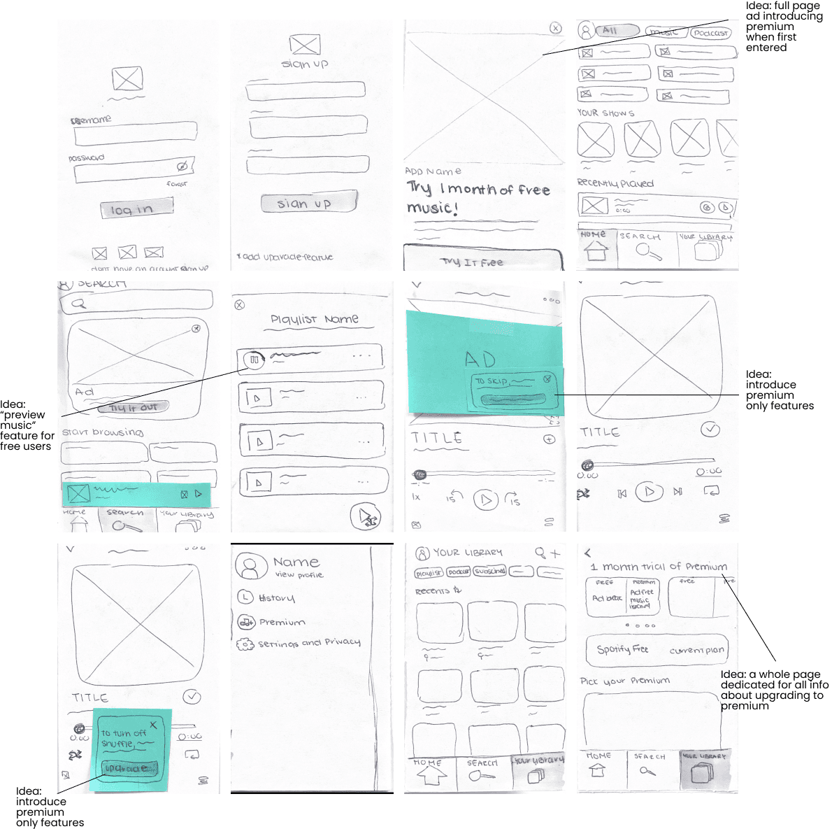
Sketches + Low Fidelity
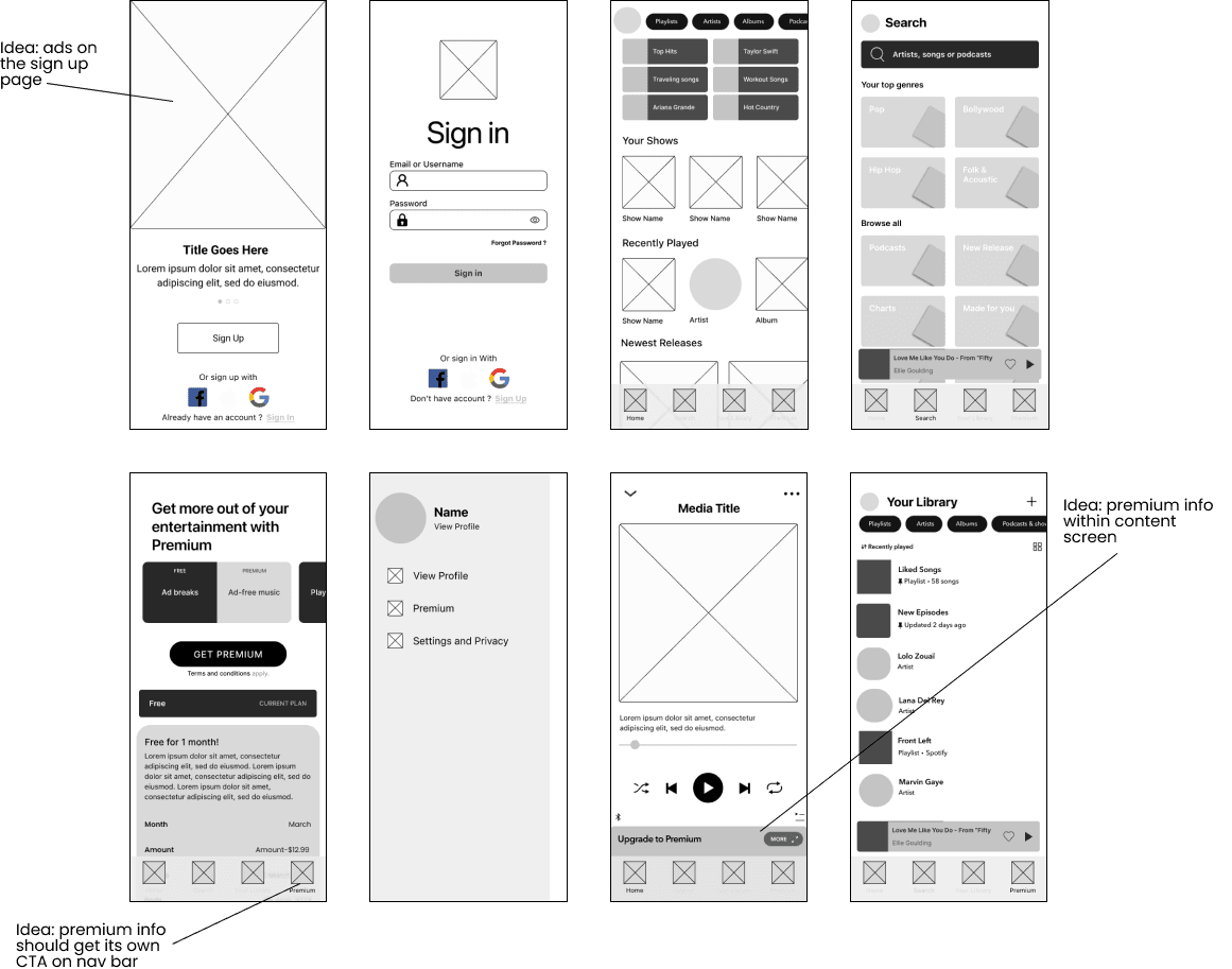
Low Fidelity Wireframes
Style Guide
Primary & Secondary
#AA86E9
#050505
I chose the color purple to convey a sense of luxury, aiming to make users feel that upgrading to premium is worthwhile and black to provide a sleek and sophisticated contrast.
Grey Scale
#FCFCFC
#EDEDED
#EEEEEE
#DADADA
#D9D9D9
#4B4B4B
Considering the diverse range of colors inherent in media posters, album covers, and thumbnail designs within the app, I opted for simplicity by sticking to grayscale for the remainder of my designs.
Iconography
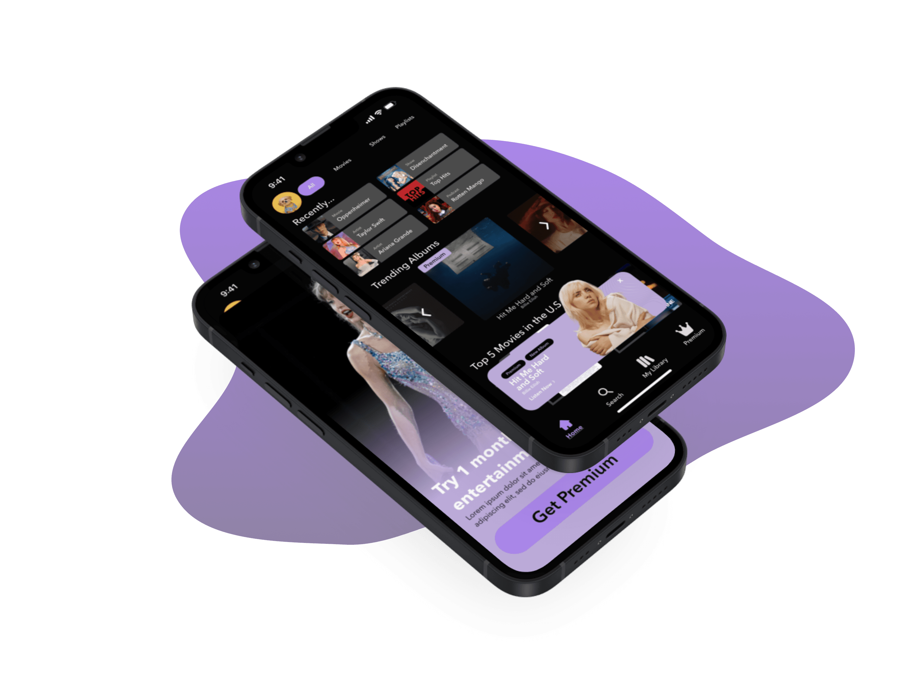
High Fidelity
Home Screen
Search Screen
Library Screen
Premium Screen
User Testing
Problem: It appears that much of the confusion users encountered while using my app stems from the "filter" feature. While this feature is highly useful in helping users find what they need, the confusion arises from the naming and hierarchy assigned to these filters.
Solution: I decided to reevaluate the confusion by considering how I named these filters from the perspective of users and their expected actions. Additionally, I prioritized the placement of filters, ensuring that the most commonly used filters are positioned closer to the front. This allows users to easily spot and access the filters they are most likely to tap on without having to scroll through all options.
Problem: I decided to reevaluate the confusion by considering how I named these filters from the perspective of users and their expected actions. Additionally, I prioritized the placement of filters, ensuring that the most commonly used filters are positioned closer to the front. This allows users to easily spot and access the filters they are most likely to tap on without having to scroll through all options.
Solution: By incorporating the two screens, I effectively highlighted the disparity between the premium and free versions. In the free version, users can play a full song, whereas the premium version provides only song snippets. Nonetheless, both versions retain the shuffle feature, a standard button for free users, which remains unchanged unless upgraded to premium.
Problem: From the beginning, I aimed to create a distinct navigation bar, but unfortunately, it ended up causing more confusion. Its tendency to blend in and appear messy on the screen, floating in the middle, exacerbated the issue.
Solution: Moving towards my final prototype, reverting to what users are accustomed to not only significantly improves the cleanliness of the screen but also makes it easier for users to navigate without inadvertently tapping on unintended buttons.
The Prototype
Key Takeaways
For this project, my main task was to find ways to incentivize users to transition from freemium to premium. I personally enjoyed this project because it allowed me to leverage my business background during the user research and interview process. I found this project extremely helpful in teaching me how to incorporate design elements that meet specific business goals while still optimizing the user experience. These were some of the most valuable takeaways from my experience:
π‘ Stay grounded in user problems and design principles: Focus on the problem statement and goals set by the company. Every element in Figma should have a clear purpose. I learned to keep asking, βWhat problem are we solving?β and to stick to core design principles for consistency.
π¨π»βπ» Language and User Priorities: Pay attention to language and prioritize users' preferences on hierarchy matters. Designing without considering how to optimally set up a feature to best fit a user's needs means designing for robots, not humans. Set up things in ways that people find most convenient rather than following a standardized approach.
βοΈ Smooth Prototyping for Efficient User Feedback: Ensure prototype flow is smooth as it significantly influences how users initially perceive the app. A seamless flow alleviates users from having to work harder, enabling them to provide valuable feedback on actual app usage.